


How to Take Better Photos for Your Business with Your Smartphone
March 7, 2025
Top 5 Places to Get Your Headshots in Kelowna
April 10, 2025
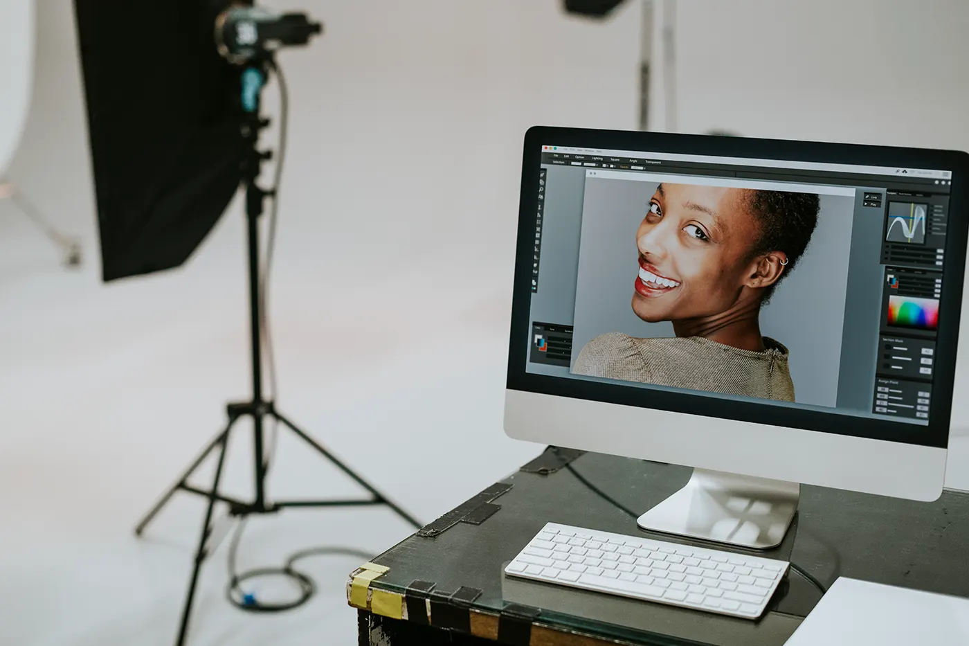
Photo editing can be a game changer, but it’s easy to fall into the trap of overdoing things. We’ve all been there—too many filters, too much saturation, or a crop that just doesn’t work. Editing should enhance your photos, not make them look unnatural. Whether you’re a beginner or an experienced editor, these common mistakes can be easily avoided, and doing so will make your photos stand out in the best way.
1. Improper Cropping
Cropping is one of the first steps in image editing, and while it can help focus on your subject, it’s easy to mess up. Cropping too tightly around your subject can cut off important details or create an unbalanced look. On the flip side, not cropping at all can leave distracting elements in the background.
To get it right, think about the composition. Try following the rule of thirds—imagine your photo split into a 3×3 grid, and place your subject along one of those lines. And don’t forget to consider where you’re posting the photo. Different platforms like Instagram or print require different aspect ratios. Always double-check that your crop looks balanced and is sized for the right platform.
2. Smoothing the Skin Too Much
In portrait editing, it’s tempting to smooth skin to get that flawless, airbrushed look. But there’s a fine line between a little touch-up and over-smoothing. Go too far, and your subject will look more like a mannequin than a person. Over-smoothing removes natural textures, leaving the skin looking unnatural and flat.
The trick is to be subtle. When retouching with editing tools, focus on evening out skin tones without completely erasing natural features. Tools like frequency separation help smooth the skin while maintaining texture, giving a much more natural feel. Always compare your edited photo with the original to make sure you’re not losing too much detail.
3. Poor Background Editing
A clean background can make all the difference in a photo, but be careful—background edits can quickly go wrong. Whether you’re blurring it out or replacing it, sloppy edits can draw attention for all the wrong reasons.
When editing your background, make sure to pay attention to the details. Use precise selection tools, especially around tricky areas like hair, to ensure that everything blends together with the background. Also, the lighting in the background should match the lighting on your subject. If the light doesn’t match up, it’ll look like the subject was pasted into the scene.
The goal is a seamless blend where the background looks like it was always part of the shot. Make sure to take your time to get it just right!
4. Oversharpening
Sharpening makes details in your photo pop, but too much sharpening can create unwanted noise and halos around objects, especially on skin. You might notice it most in portraits, where over-sharpening can make skin look rough and unappealing.
Instead of cranking up the sharpening slider, apply the effect subtly. A good technique is to use the high-pass filter, which allows for controlled sharpening that doesn’t overdo it. And always zoom in at 100% to see the impact of your edits. Sharpening should make your image clearer and more defined, not harsh or noisy.
5. Overusing Contrast
Contrast is a fantastic way to make an image more dynamic by deepening shadows and brightening highlights, but too much contrast can lead to a loss of detail. When you push the contrast too far, you’ll end up with parts of your photo that are either too dark or too bright, completely losing the detail in those areas.
To avoid this, use the curves tool, which gives you more control over the tonal range. It’s better to make small, gradual adjustments to the contrast instead of making big changes all at once. A good rule of thumb is to check your histogram and make sure you’re not pushing the shadows or highlights too far. A little contrast goes a long way in making your photo pop without losing detail.
6. Oversaturation
We’ve all been guilty of bumping up the saturation to make a photo more vibrant. While adding colour can make your image more lively, too much saturation can make the colours look fake and garish. If you’ve ever seen a portrait with skin tones that look like an orange filter was slapped on, you know what I mean.
Rather than over-saturating the entire image, focus on adjusting individual colours. The vibrance slider is your friend here because it increases the intensity of muted colours while leaving already vibrant tones untouched. If you’re unsure whether you’ve gone too far, compare the edited image to the original. Vibrancy should enhance the natural look of the photo, not distort it.
7. Incorrect Colour Temperature
Colour temperature plays a big role in setting the mood of your photo. If it’s off, your photo might look too warm or too cool, throwing off the entire vibe. You might notice this with indoor photos, where artificial lighting can give the image an overly yellow or orange tone. Or, in outdoor photos, the image might feel too blue or cold.
To fix this, start with white balance adjustments. Select a neutral area in the photo (something white or gray) to set the correct temperature. From there, you can adjust the warmth or coolness to get the right feel. Be mindful of the light conditions when shooting. Indoor photos under warm lights will naturally have a yellow tone, while outdoor shots will be cooler. Matching your edits to the light source will keep things looking natural.
Edit with Care
Editing photos is all about enhancing what’s already there, not changing it into something unrecognizable. Avoiding these seven common mistakes will help you maintain the natural beauty of your images and make them visually appealing.
Not a photo editing pro? No problem. Buzz Photography can take care of everything—from capturing the shot to editing, ensuring your photos are ready to go.


